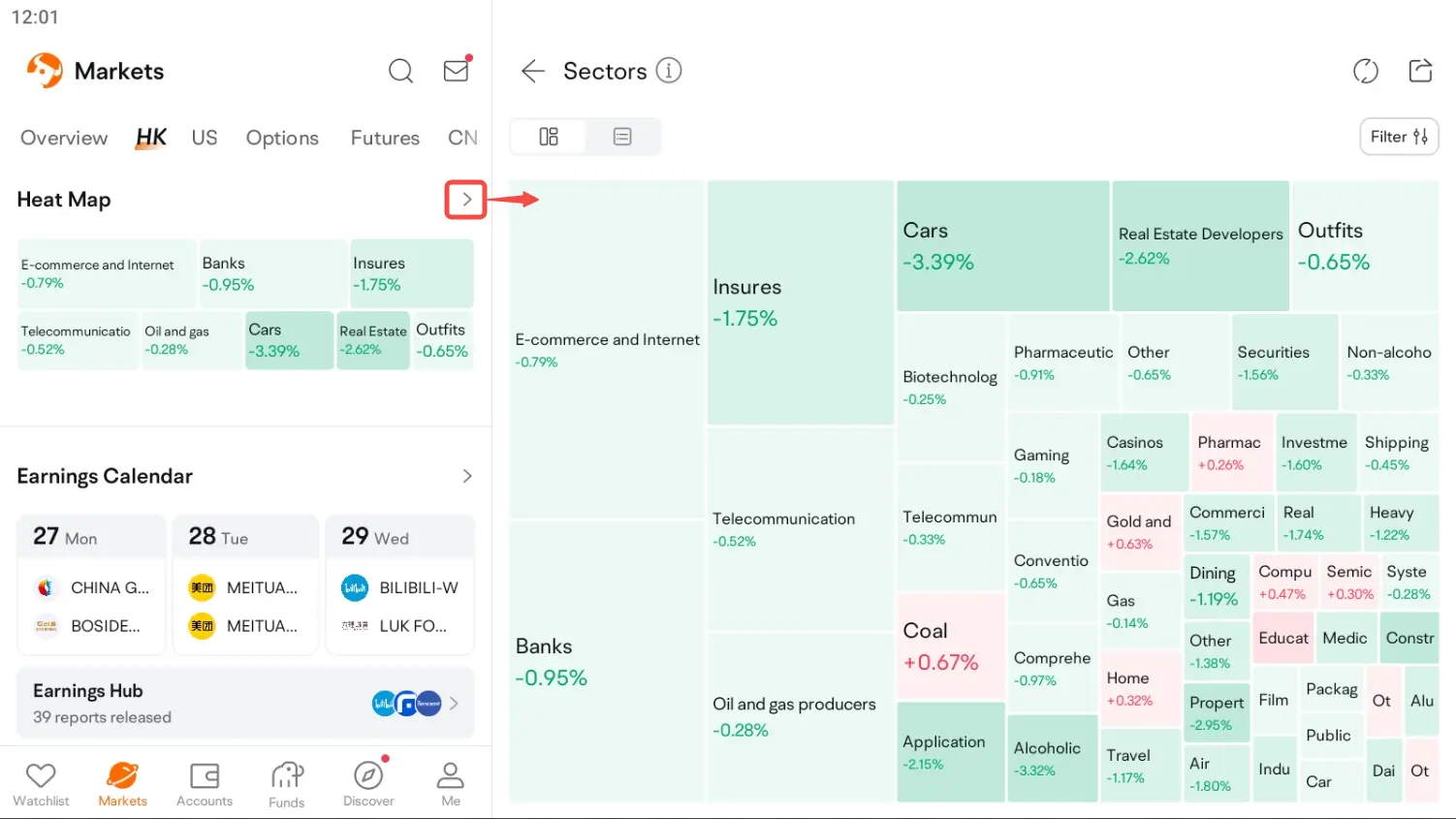
Heat map
1. Entry
Market - HK/US - Heat Map
2. How to Interpret the Heat Map
2.1 Area of a sector
The heat map can be drawn by Market Cap, Volume, and Turnover. Take the heat map drawn by Market Cap as an example. The larger the total market value of the corresponding stock is, the larger the sector area will be. The sector area is calculated as follows:
Sector Area = Total Area * Sector Market Cap / Total Market Cap
2.2 Color of a sector
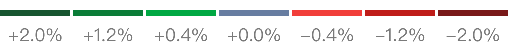
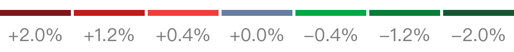
Square color reflects gains and losses of a sector. The stronger the price moves, the greater the contrast between square color and background color.
Green Up / Red Down:
Red Up / Green Down:
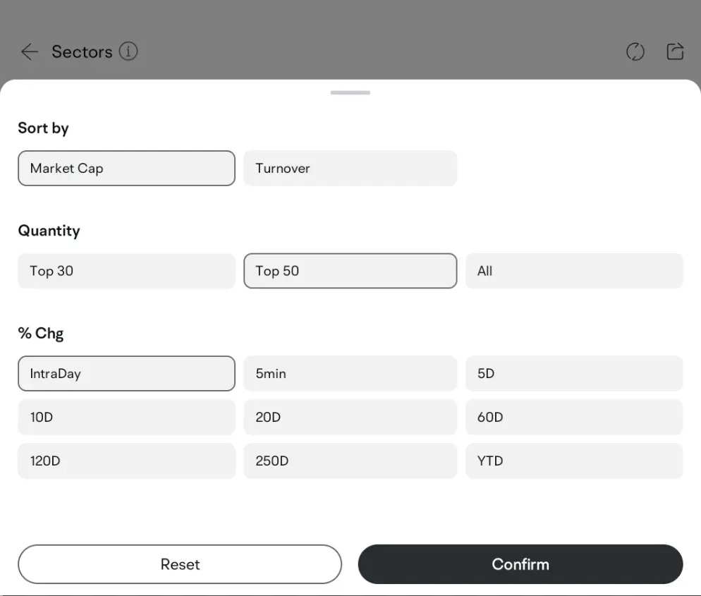
3. Custom Settings
3.1 Sort
Sorting will affect the order and area of a sector. You can sort the sectors by Market Cap, Volume, and Turnover.
3.2 Quantity
The quantity of sectors will be changed. Top 30, Top 50, and All are available.
3.3 %Chg
%Chg will affect the color of a sector. You can view it by intraday, 5m, 5D, 10D, 20D, 60D, 120D, 250D, and Year.